How to Design Viral LinkedIn Visuals

Will McTighe
September 23, 2024
Hey, I’m Will McTighe. I grew my LinkedIn from 4,000 to over 170,000 followers between March and September 2024. Here’s what I’ve learned about designing visuals that actually get noticed.
Designing Great LinkedIn Visuals
Struggling to design good LinkedIn content? You’re not alone. I was in the same position before I grew my audience by 180k followers in under 7 months. One key takeaway? The standard of visuals on LinkedIn is rising.
To get noticed, your visuals need to stand out. The goal is simple: create visuals that are shareable, beautiful, or emotionally powerful. You want people to pause when they see your post and want to share them immediately.
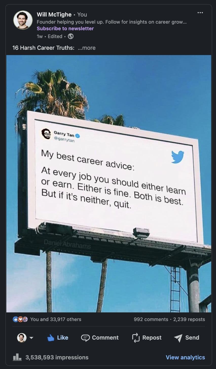
Visuals are also a critical part of your hook—they’re often what draws people in before they even read your first line. When someone scrolls through their feed, they’ll see the entire visual but only a snippet of text. That means your visuals can make or break whether someone stops to see more.
1. Nail Down Your Brand Aesthetic First
Before jumping into creating visuals, let's talk brand aesthetics. Your visuals should instantly scream you. Think of it like setting your brand's vibe—consistent, recognizable, and uniquely yours.
Here’s how to do that:
-
Pick Your Colors: Choose 2-3 colors that match your brand's personality. Think of one bold color for titles or accents and a couple of neutral shades for everything else. It's all about making sure your content looks cohesive without being over the top. I got a designer to help with this.
-
Choose Your Fonts—and Stick with Them: Find one or two fonts that capture your brand’s tone. Bold sans-serif fonts can look clean and confident, while serif fonts might give a more classic feel. Keep it simple—your content should look the same every time someone sees it.
-
Keep Icons and Images on Brand: You'll want to use icons and images, they should match your vibe. Minimalist? Stick to simple icons. Modern? Go for sharp, clean lines. And if you’re adding filters to images, make sure they’re consistent across all posts.
-
Stay Consistent Across All Platforms: Whether you’re posting on LinkedIn, Instagram, or anywhere else, your visuals should feel like they belong to the same family. Consistency = recognizability.
-
Make a Quick Style Guide: Create a simple doc that outlines your brand colors, fonts, icons, and layouts. Trust me, this will make your life easier when you start creating content regularly—or when you decide to bring in someone else to help out.
For example, my brand colors are green, orange and beige and you see them everywhere in my content and profile.
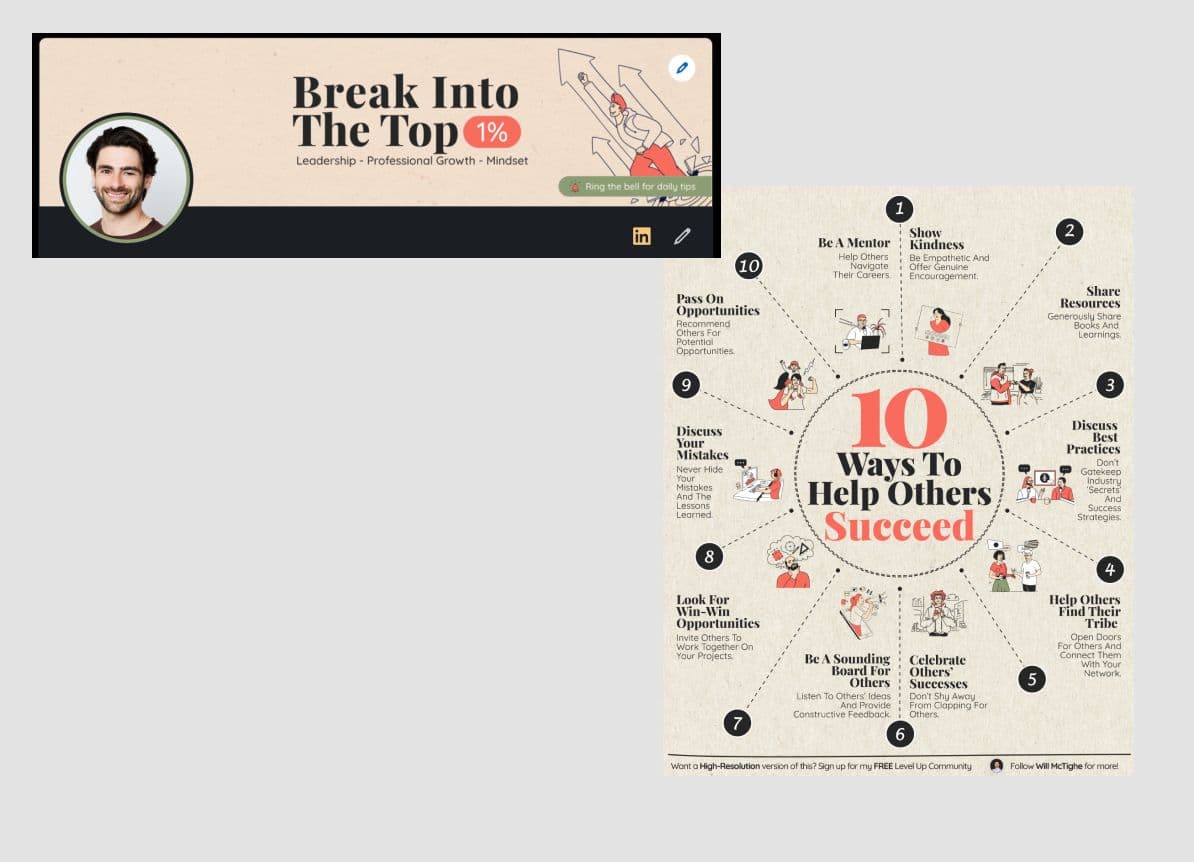
Key Takeaway: Your visuals should match your voice. If your posts are casual and laid-back, your designs should reflect that. If you’re all about being the authority in your space, make your designs look sleek and polished.
2. Visual Formats That Help You Grow
Now that your brand aesthetic is locked in, let’s talk about the types of visuals that will help you grow on LinkedIn.
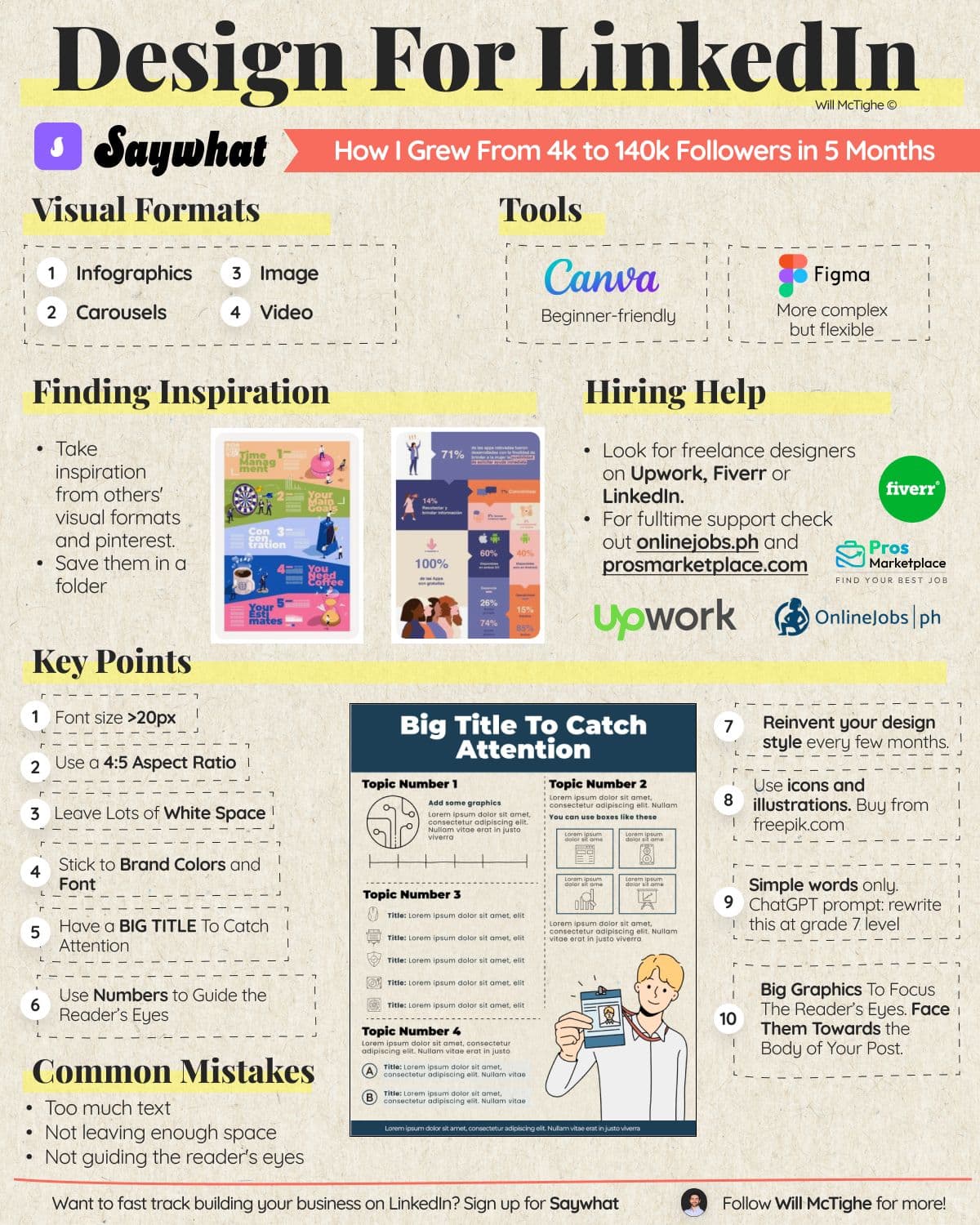
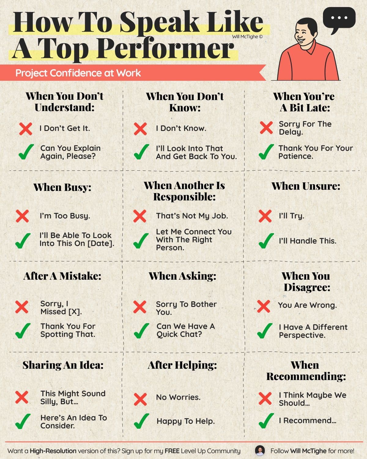
- Infographics: Information-dense educational guides (e.g. how to speak more confidently at work)
- Carousels: Slide through engaging stories or step-by-step instructions like how to do a job search more effectively. Carousels get higher dwell time as users slowly flick through them so can get a lot of impressions.
- Images: Simple, clean, and emotive images with a powerful quote.
- Videos: Great for trust-building (if they're of you) and get lots of impressions because there is a separate feed for video with little competition on it. However, videos typically convert fewer followers. Like this video with career advice from Barack Obama that my friend Justin Wright posted.
3. Tools to Use
You don’t need to be a designer to create great visuals. Here’s what I use (and recommend):
- Canva: Best for beginners. Easy to use, great templates, and perfect for quick designs.
- Figma: A bit more complex but offers more flexibility for those looking to take their visuals to the next level.
4. Visual Design Tips
Here are a few tips to make your visuals stand out:
- Font Size >20px: Always aim for larger font sizes so it's readable on any device.
- Use a 4:5 Aspect Ratio: This helps maximize your visual space on LinkedIn’s mobile feed.
- Leave Lots of White Space: Don’t clutter your visuals—white space helps your design breathe.
- Stick to Brand Colors and Fonts: Consistency is key for brand identity.
- Use a BIG Title to Catch Attention: This will be the first thing readers notice. Make it easy to understand.
- Use Numbers to Guide the Reader's Eyes: A numbered list or bullet points show people where to look.
- Reinvent Your Design Style Every Few Months: Stay fresh and keep your audience guessing!
- Keep an Inspiration Board: Save visuals that inspire you. It’s a great resource when creating your own content.
- Simple Words Only: Use this ChatGPT prompt: "Rewrite at grade 5-7 level." Keep it accessible and easy to read.
- Use Lots of Consistent Icons: Sites like Freepik are great for finding icons that match your brand.
- Big Graphics to Focus the Reader’s Eyes: Use images that face towards the body of the post to naturally guide the viewer.
5. Common Mistakes to Avoid
Here are the pitfalls to steer clear of when designing your visuals:
- Too Much Text: Keep your message clear and concise. Don't overwhelm readers.
- Not Enough Space: Cramped visuals are hard to read. Make room for your elements.
- Not Guiding the Reader’s Eyes: Use visual cues (like arrows or numbers) to show where the eye should go next.
6. Need Help with Design?
If you want help with your design skills, don’t stress:
- Freelancers: Sites like Upwork, Fiverr, or even LinkedIn are great places to find talented freelance designers.
- Full-time Support: For more dedicated help, check out OnlineJobs.ph or ProsMarketplace.com.
Your visuals are more than just pictures—they shape your brand's identity and help you stand out on a crowded feed. Make sure they're memorable!
Start building your personal brand today.
Join top executives and creators in using our AI-powered writing, community, and lead gen tools to scale your LinkedIn business.
